Logos & Identity Systems
Logos and identity systems serve as a visual representation of the company and its core values. They provide a great way to make your company recognizable and identifiable immediately. Logos can be shapes of objects or just words of the company’s name. It is important to develop a logo that is simple and easily deployed to different mediums – print, social media, websites, videos. Depending on the personality, some companies do a mixture of both and can be just as effective.
Take a look some of our logo designs and see how we represent our clients accurately and creatively.
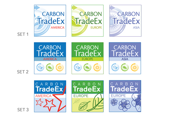
Carbon TradeEx (service re-branding)
Koelnmesse has requested us to create a new brand for the aging Carbon Forum America trade show. The trade show event is rebranded to Carbon TradeEx. The new brand needs to extend to the sister trade shows in Asia and Europe. We proposed 3 concepts of which the last set was finally chosen as the logo of choice.
goroo (new online service launch)
As part of a new online service launch, Evo researched and recommended the name goroo.com for the new multimodal trip-planner system developed by the RTA (Regional Transportation Authority of Illinois). Shown here are some of the proposed logos and identity system concepts for goroo.
The name “goroo” is the outcome of a brainstorm based on several key factors:
- goroo – a truncation of “Go Kangaroo”, reflects the attributes of the multi-modal trip planner. A kangaroo hops from place to place, is fast and is family-friendly.
- The name goroo sounds like “guru” – an expert.
- The name goroo is simple and memorable.
- The domain name is available for use.
Kirix Strata (product launch)
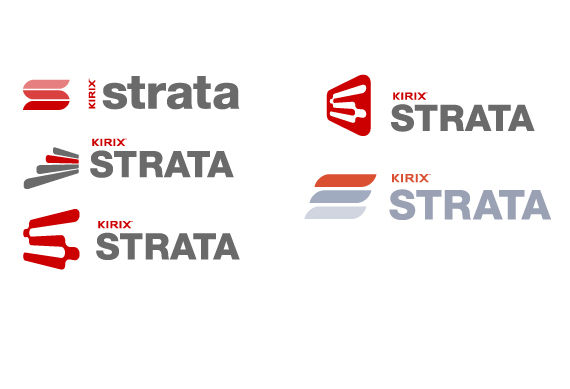
Kirix is launching a new software called Strata. We created several logo concepts for the product of which one is finally chosen.
The key words driving all the logos are: Powerful, Flexible, Simple, with an emphasis on a “cool” user experience. This direction draws from the meaning of strata – meaning “layers”. Here it symbolizes the layers of information and also the literal layers of table cells in the program. The symbol represents layers of stylized “cells” that transform into a “S” shape. The gradations in color imply movement and flexibility. The type is simple, bold, and powerful while being friendly and approachable. It coexists perfectly with the existing Kirix logo.
Family Matters Chicago
Family Matters is a family-centered organization in Chicago’s Howard neighborhood that seeks to be a catalyst for change – building and strengthening the community through programs that support personal growth and leadership. We have the opportunity to revamp their branding, logo and identity systems. The new identity is now applied to their business cards, letterheads, envelopes, and brochures. This refresh allows us to inject a renewed excitement in the organization and provide the organization with a brand new look.


